adidas
Brand
Direction
adidas started a brand transformation in 2015, which led to the biggest increase in share price over a 5-year span in the company's history. The revamped visual direction was a tangible reflection of the attitude shift happening within the company.
This internal attitude film set the tone for the brand.
In-house editing by Rory Magnus
Thank you!
Below is an edited sampling of the adidas brand direction. The content and creation was possible thanks to the hard work and talent of the best in-house creative team I know.
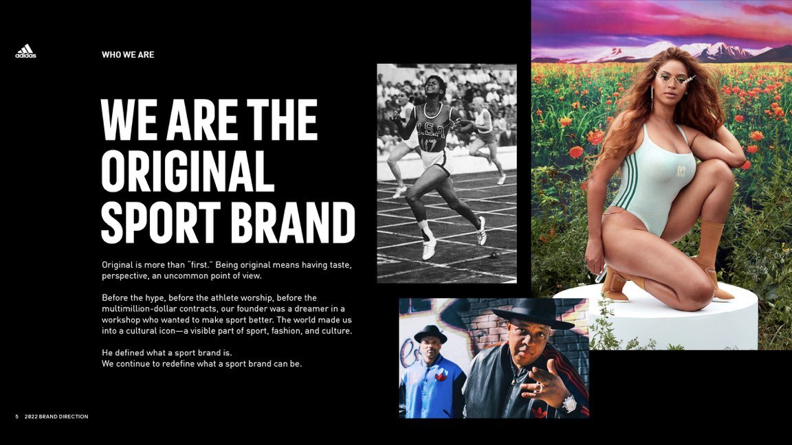
Any new direction must begin with an understanding and appreciation of the history and DNA of the company. We began our new direction by reminding ourselves of who we are and putting our current goals and initiatives into the proper context.
Without the consumer there is no adidas. Our approach has always been to start by understanding the insights and mindset of our consumers before making any decisions.
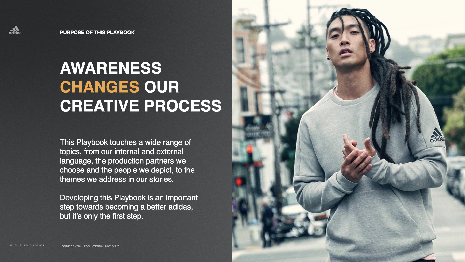
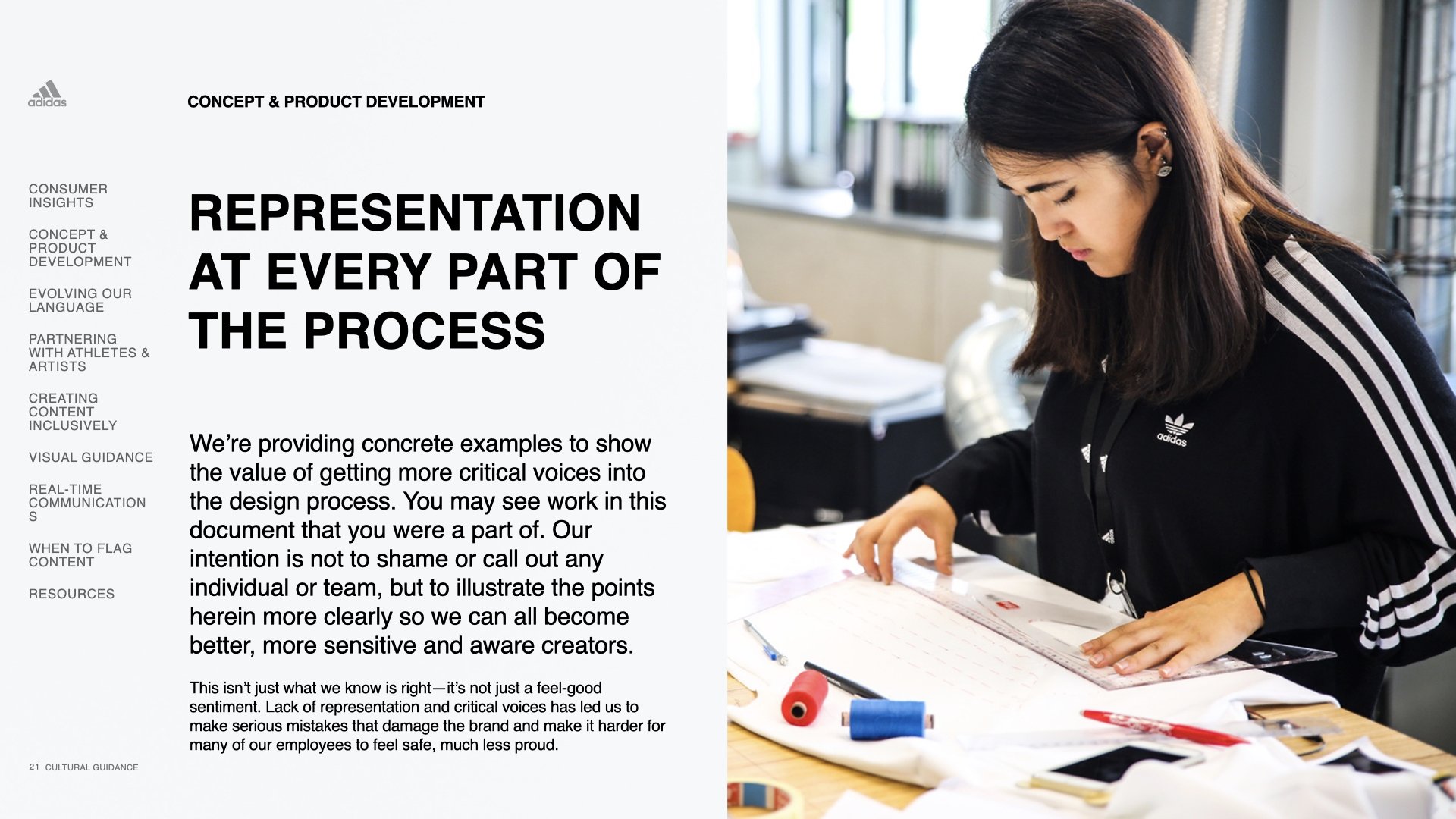
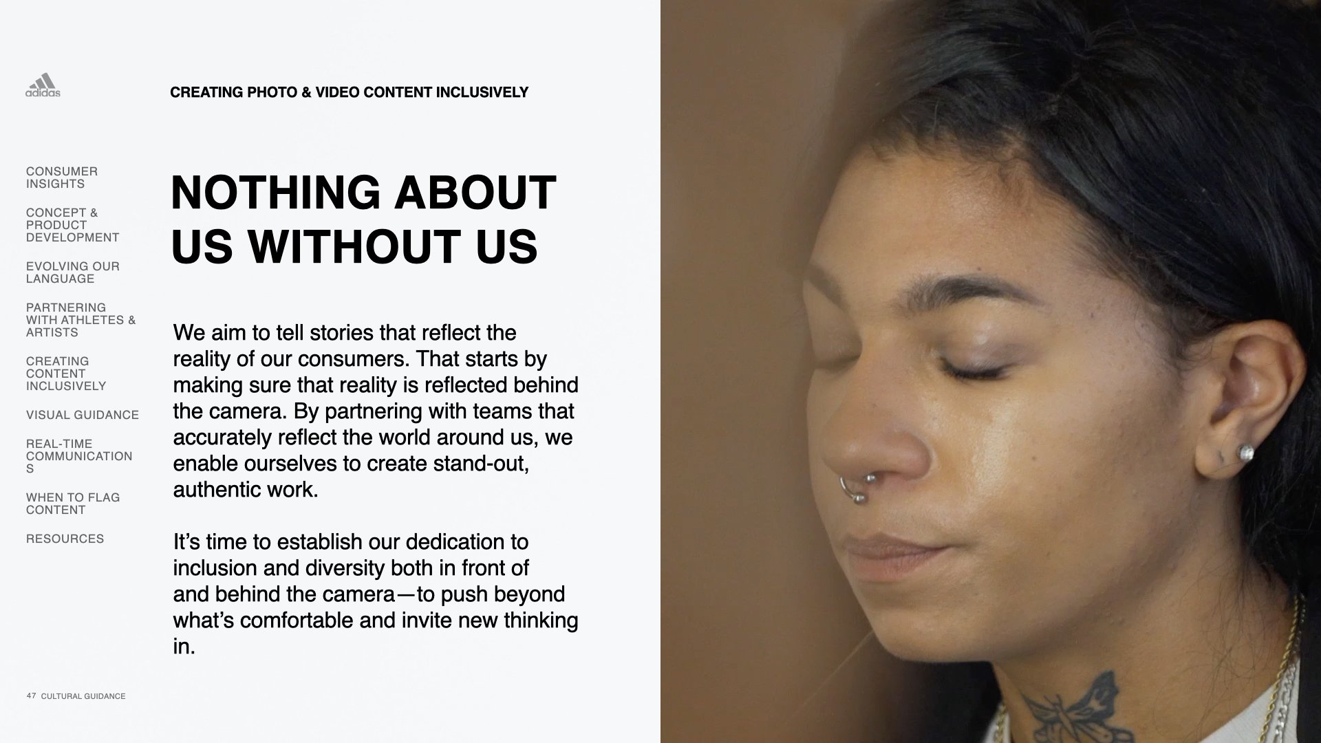
The racial reckoning that began after the murder of George Floyd prompted the company to take a closer look at what and how Adidas makes and markets its products. In response we created this playbook to educate and raise awareness about the biases that negatively impact the creation process.
This playbook provides cultural sensitivity information to our multinational workforce and offers simple guidelines to avoid common insensitive missteps.
Understanding the brands’ attitude is the first step to creating work that strikes the right tone both verbally and visually.
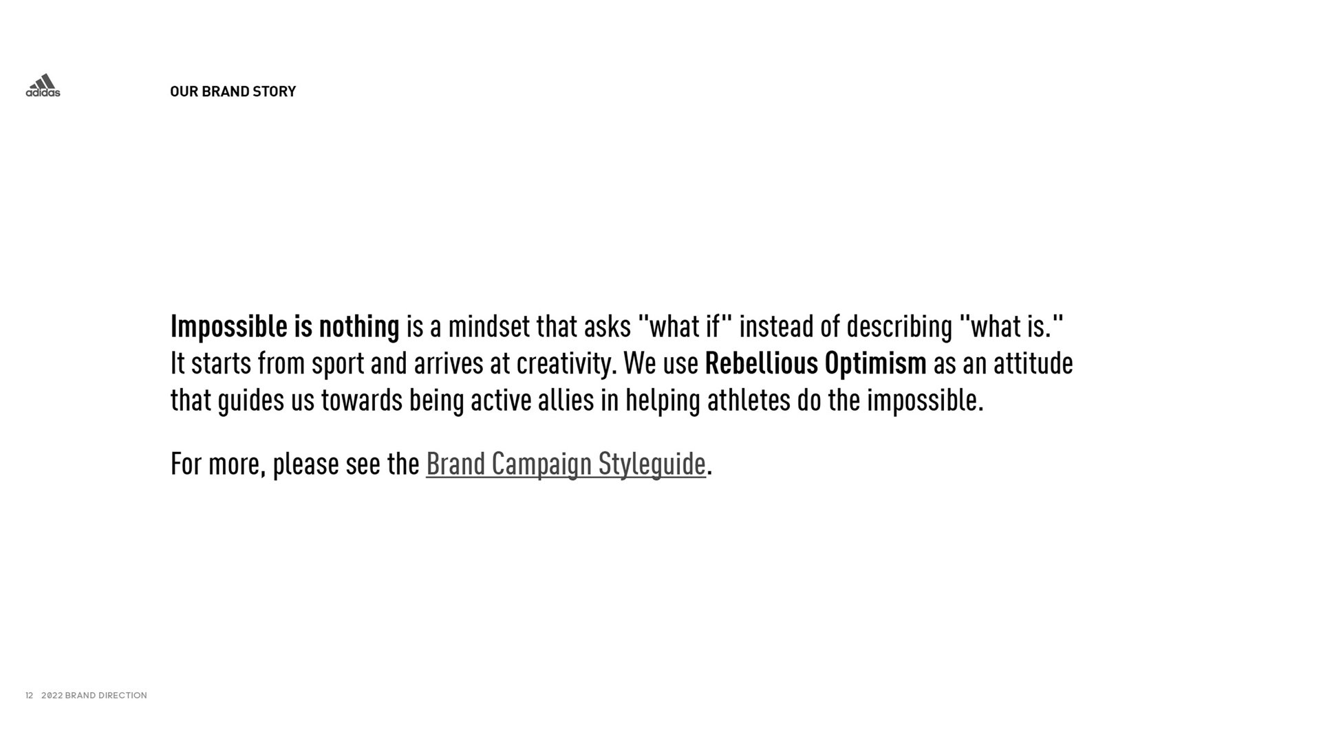
The brand relaunched the 2004 award winning campaign “Impossible is nothing”(IIN). The campaign is the outward expression of the brand attitude.
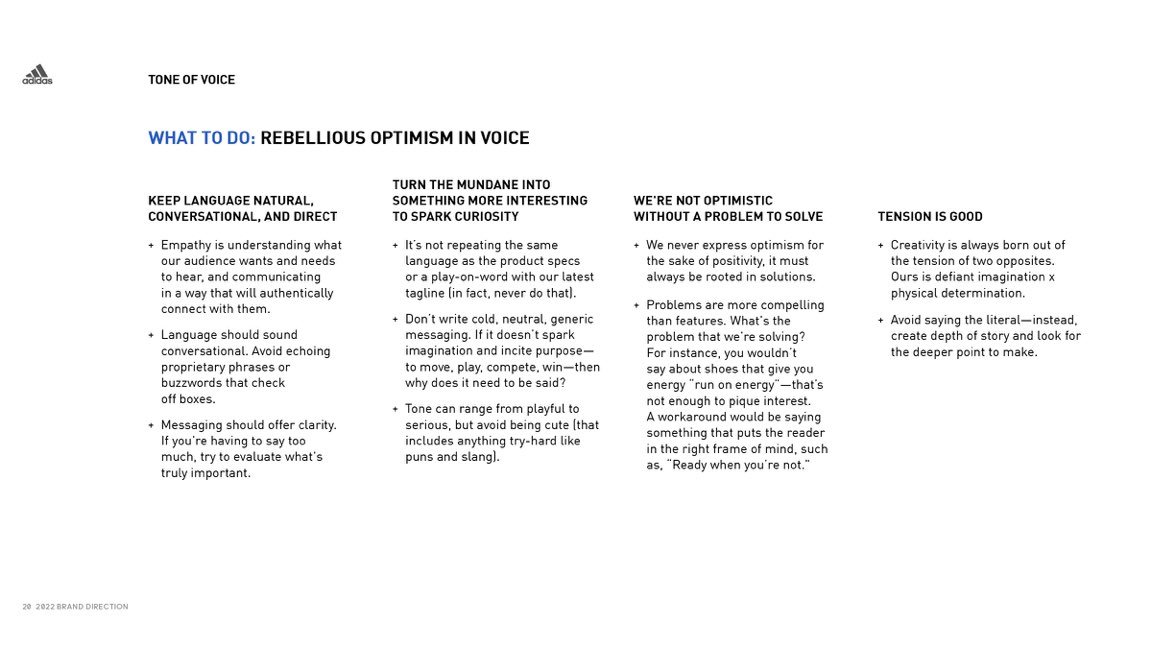
In order to ensure understanding in its expression, we detailed how the attitude should be reflected in both written and spoken language.
A simple framework was created to help the hundreds of internal and external creative practitioners be able to more confidently create and review their work.
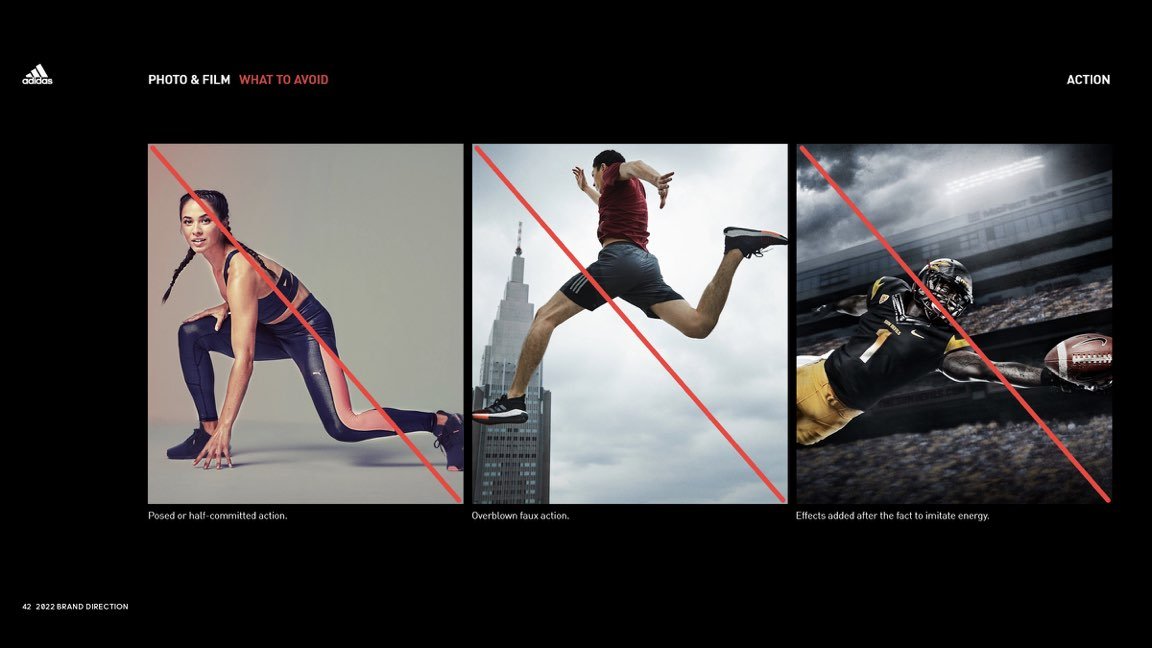
Original imagery and film is central to connecting with the adidas consumer. Simple principles were created to unify the key visual elements in all brand work.
For a footwear and apparel sport and lifestyle brand, styling is critical. We worked with the retail and sales organization to strike a balance between the demands of selling products and representing the brand.
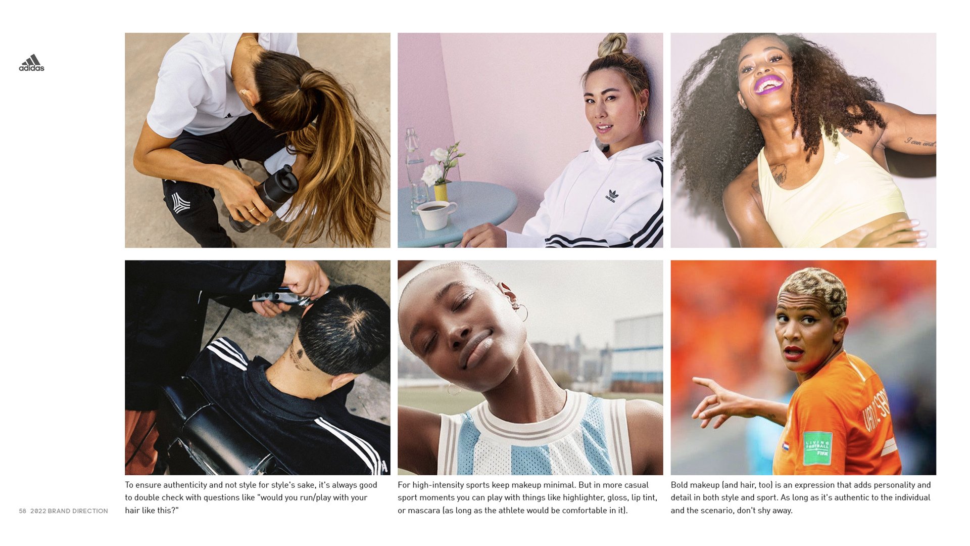
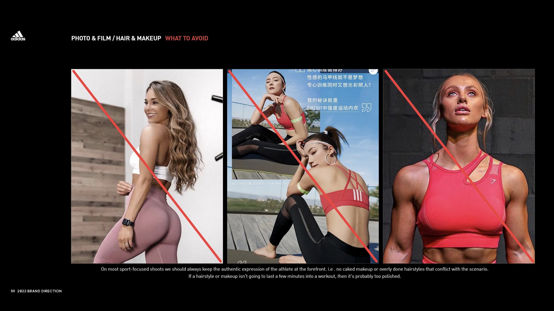
As a predominantly male company in a male-dominated industry, representing women in our brand imagery required a high level of detail in outlining a proper approach for make-up in sports.
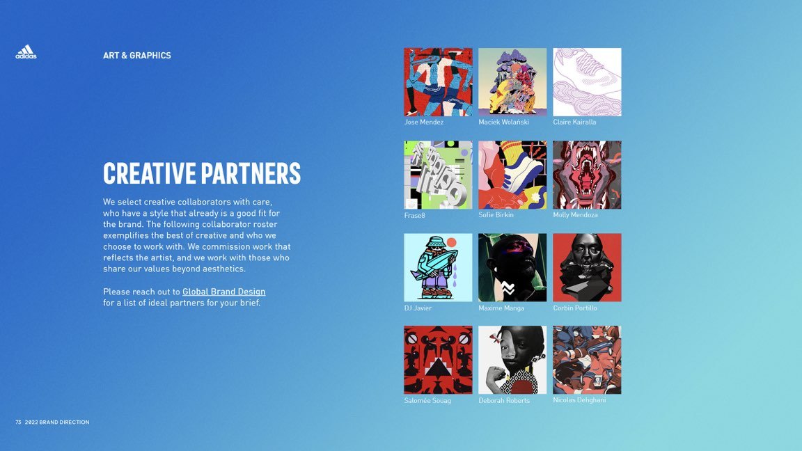
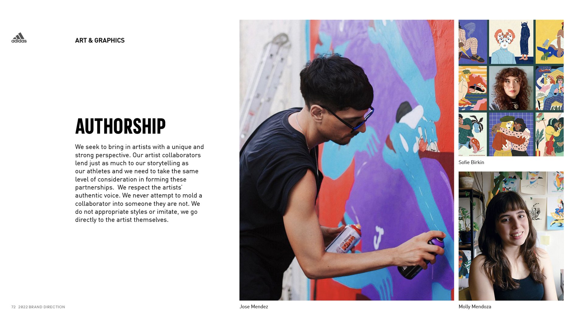
Creating guidelines for expressive art forms can be precarious. Providing guidance that is too rigid can stifle the creative output of artists and collaborators. We developed best practices to help marketing teams navigate the world of commercial art with greater ease and flexibility.
The back half of the direction focuses on the section of the guidelines that have the strictest rules and guidelines. Branding, typography, and color are essential elements that help to maintain consistent brand identity and recognition year after year.
Throughout the document there are examples of what to avoid, which can often be more informative and beneficial than the guidelines for what to do.
In order to further support the agencies and creators responsible for bringing the work to life, we created a more comprehensive document that provides additional specifics to ensure the desired outcome is achieved.
I have never come across a full-proof guideline. Oversight and assistance are always required to some extent. To assist the many teams and projects we set up a dedicated email to respond to questions or comments.
The adidas business is large and extensive requiring the creation of supplementary guidelines for key initiatives, businesses, or franchises.
